Myanmar Memories

After a busy summer for my two most recent paintings in gallery shows and Orion magazine, as discussed in my previous post, I am pleased to announce that my Delicate Arch painting was awarded 3rd place in the Yadkin Cultural Arts Center’s 13th Annual Juried Show. I am also pleased to announce that after all of the other distractions this summer like the Olympics and the all-encompassing upcoming election, I have just finished a new painting.

It’s been quite a while since I’ve painted any of the “Women of the World” whom we met in our travels, so I thought it was time to revisit some memories from a wonderful trip to Myanmar that we took 26 years ago. The highlights of the trip included Yangon and its Shwedagon Pagoda, Bagan and its thousands of temples, and our overnight trek into the northern mountains where we stayed with some local people.

The Shwedagon Pagoda in Yangon is a jewel. Here is a picture of its elaborate stairway entrance. For reasons of religion and respect, you are required to climb up to and around the temple grounds completely barefoot - not even with socks. It’s a good strategy to visit in the cooler mornings or evenings since the stone surfaces can get very hot in the mid-day sun.

When you reach the top of the covered stairway, you find the famous stupa. Legend has it that the stupa was built more than 2500 years ago which would make it the oldest Buddhist stupa in the world. Of course, it’s hard to verify this legend, but the pagoda is very old and very impressive. The stupa has been damaged by earthquakes over its lifetime and repairs and additions have been made many times. Records show that the stupa was raised to its current height in 1775 after it was damaged by a serious earthquake in 1768, and in 1871 a new crown umbrella was installed.

Here is a picture of the stupa.

Bagan is not known for a single magnificent temple like the Shwedagon Pagoda, but instead for its multitude of temples. From the 9th-13th centuries, Bagan was the capital of the first kingdom that unified the regions of current Myanmar. By the 13th century, more than 10,000 Buddhist temples were built in Bagan as each temple provided religious merits to its builder. The remains of over 2,200 of these temples have survived. Here is a photo of a group of these temples, but there are more in every direction you look!

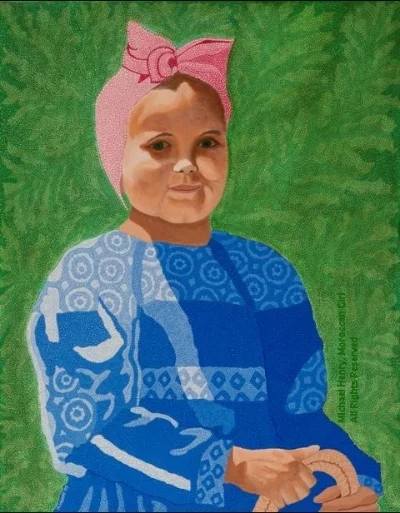
Trekking in the mountains of northern Myanmar was a very different, more remote experience. Our guide took us to various tribal villages where we visited and stayed overnight with the local people. The children were especially curious about us and followed us everywhere we went. Here is a picture of one group of villagers we met. The older woman was wearing tribal clothes and was making new layers to repair the thatched roof of her bamboo home. The ever-present children wore more modern clothes. The young girl behind her is the subject of my newest painting Myanmar Tribal Girl.

The Portrait

The first step for the painting was to do a very quick pencil sketch from a portrait photo I took of the young girl.

Next I painted in the layers of background color for everything but her face and arms. You’ll also notice that the background is filled with rows of the Triratna symbol. This is a Buddhist symbol that visually represents the Three Jewels of Buddhism - the Buddha, the Dhamma and the Sangha. These symbols are hard to see now, but will become more visible when additional layers of color are added later.

The picture below shows a Triratna on each of the two carved footprints of Buddha. There is a lotus flower within a circle on the bottom and a trident on top with three branches representing the Three Jewels.

Next, my Contextural style patterns were painted on her headwear using darker colors than the background.

Then a final top layer of dots was painted using even darker colors which further enhance the patterns against the lighter background.

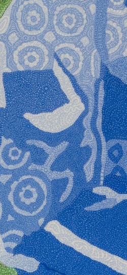
Patterns were painted on the entire dark bib of her dress using a lighter color of blue to help make the darker background standout.

An intermediate blue color between the darker background and lighter patterns was used for the final layer of dots to help blend all of the colors and soften the patterns.

Very different Contextural patterns and dots were then painted on the sleeves and skirt section of the dress. These patterns do not cover the entire areas like the patterns on the bib do and are more like floral pinstripes.

Colorful dots were also painted onto the Triratna symbols to make them pop more in the background. Multiple layers of dots were then painted onto the flowers held in her hands.

To finish the sleeves and skirt, very light blue dots were painted around all of the pinstripe patterns to provide more Contextural texture.

At this point, It was time to paint the most important parts of the portrait - her face,


and her arms and hands.

The final step of the portrait was to finish the background to provide more color, depth and texture. Around each of the Triratna symbols I painted two circles of bronze colored dots. They represent the cut ends of large bamboos that are important parts of the villagers’ survival in the mountains as they are used to construct all of their buildings.

Below is a picture of the complete painting of Myanmar Tribal Girl.

A Busy Summer for My Most Recent Paintings

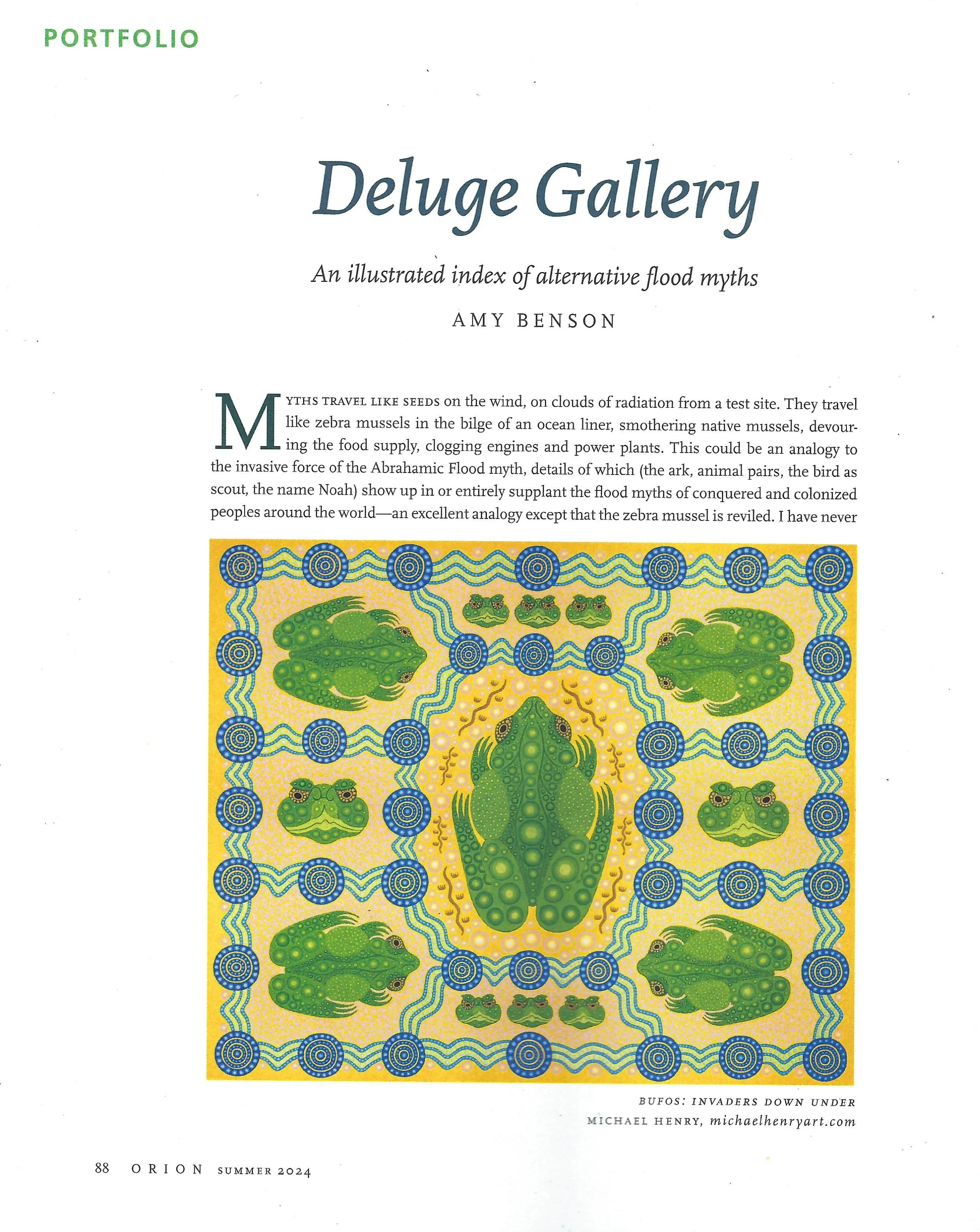
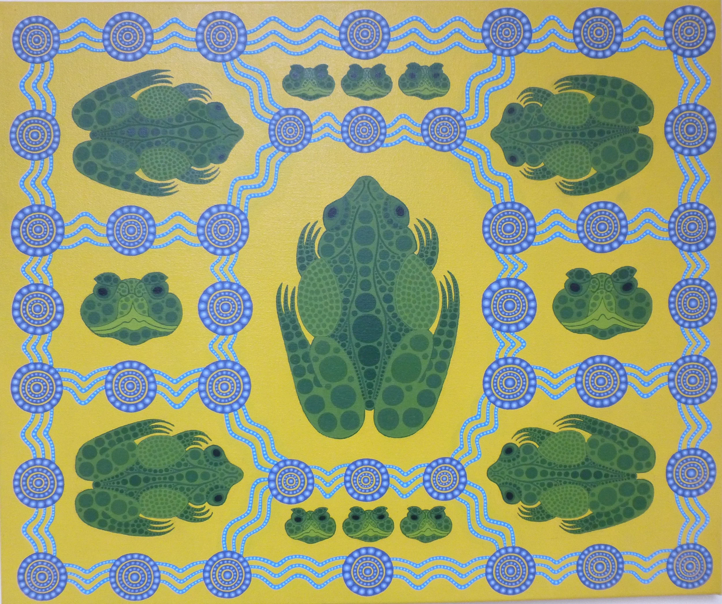
I’m proud to announce that it’s a busy summer for my two most recent paintings. Bufos: Invaders Down Under was selected for the Arts Council of York County’s 35th Annual Juried Competition in Rock Hill, SC. The awards ceremony is Thursday, August 8 at 5:30pm and the show is open now and will continue until August 24. If you want a brief look at the York County show, put your arrow on the following space to highlight a link to its web site - https://www.yorkcountyarts.org/35thjuried If you are patient and wait for the fourth photo you can see a side view of my painting next to the marionettes. It seems to have a nice location near the gallery entrance and visible from the street. A clearer photo of the painting is shown below.

Even more exciting is that the Editor in Chief of Orion Magazine contacted me a few months ago requesting the use of this painting as the main illustration for an article in their Summer Issue. Orion Magazine is a non-profit quarterly magazine that takes no advertising and survives on subscriptions and donations. It averages about 25,000 subscribers. It invites its readers “into a community that cares deeply for the planet with writing and art that explores the connection between nature and culture and inspires new thinking about how humanity might live on Earth justly, sustainably, and joyously.”

The Orion readers seem to be an ideal audience for my paintings, and I feel fortunate to have my painting and website gain exposure with this group.

Below are photos of the cover of the Summer 2024 issue of Orion and the first page of the article illustrated with my Bufos painting. The colors of my painting on their page are a bit muted from their use of environmentally sound paper and inks when compared to the image of my painting shown above.


Next, my most recently completed painting Delicate Arch (shown below) has been accepted into the 2024 Yadkin NC Arts Council Juried Show. My Snow Leopard painting was in the Yadkin show last year and we really enjoyed it. The art exhibited was quite varied and impressive. The Yadkin Cultural Art Center stands out in the small town of Yadkinville, and they had the most elegant gourmet food at their reception that we’ve seen at any of these events! The opening reception and award ceremony is July 12 from 5-7pm, and the show will run from July 12 - August 30.


I’ve been working hard on a new painting for the past several months and hope to have it completed sometime this summer. I look forward to publishing a new post when it’s done.

Enjoy your summer everyone!

Delicate Arch

Thirty years after our trip to the national parks in southern Utah and seven years since I painted a vast expanse of hoodoos in Bryce Canyon, I felt drawn again to paint more of the magnificent red and orange rock formations from this memorable trip. You can see and read about the Bryce Canyon painting as well as one of my earliest paintings of the Balancing Rock formation in Arches National Park in my previous blog posts.

Our fascination with Arches National Park began as we were approaching the park and saw our first arch in the distance across a strangely fluid bed of rock. Here’s the picture we took.

We didn’t know which arch it was, but we soon discovered that it was Delicate Arch - one of the most famous features in the park. We found the beginning of the trail to the arch and set off. It was quite a long walk across tilted and slippery solid rock with very few signs. We were starting to wonder if we were lost, but finally, Delicate Arch rose up ahead of us. When we first saw this arch from the road, it had looked kind of small and delicate. However as we hiked up to it, we saw that although some of the rocks did look delicately balanced, the total arch was really quite massive. Here is a closer picture including people (see them on the far left) that gives a better perspective of its size.

The Original Drawing

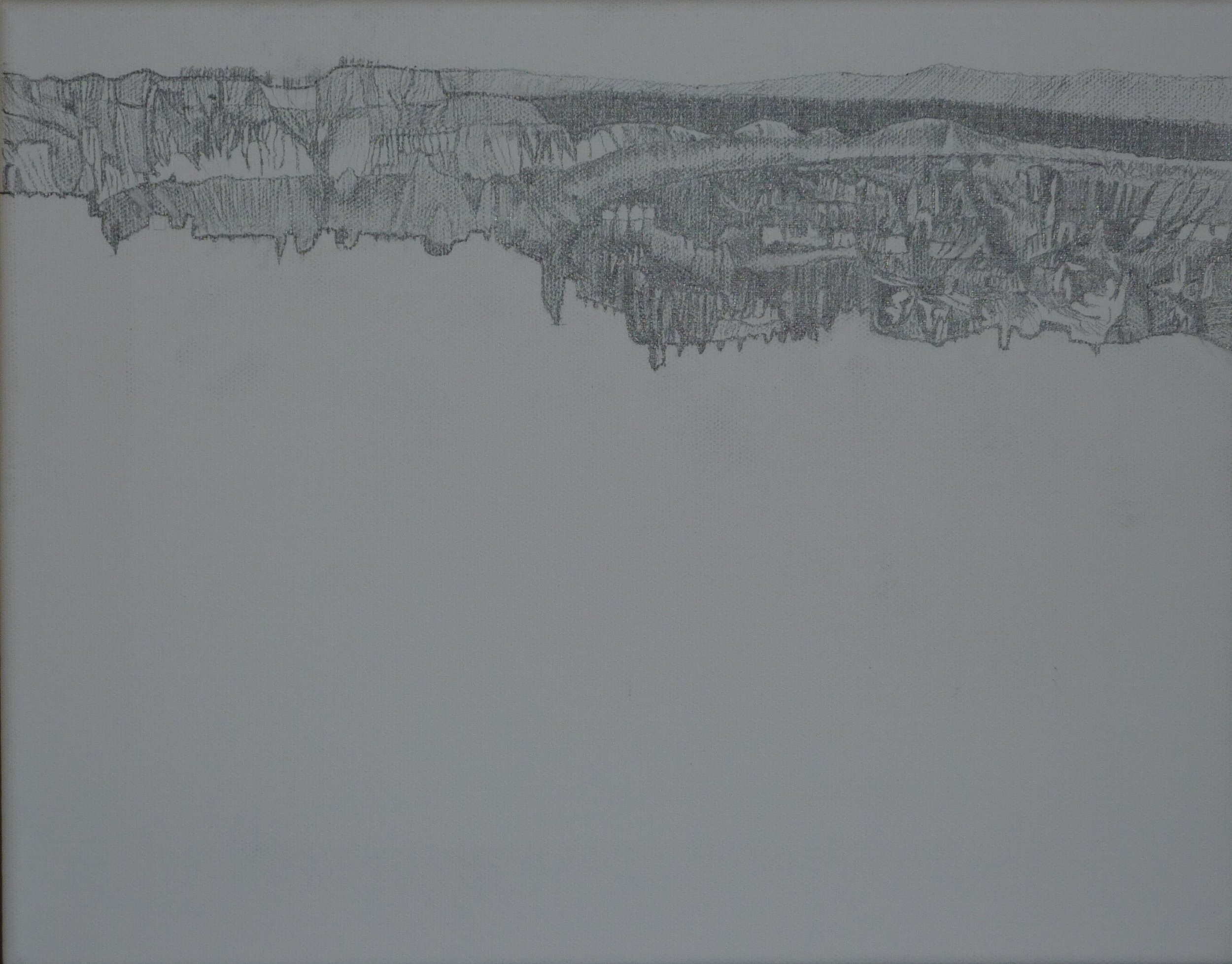
As with all of my paintings, the first step was to complete a pencil drawing. Here are pictures of the drawing as it progressed.


The Painting

The painting process started by applying the base background colors over the pencil drawing. The timing of the painting is close to sunset, so the rocks all have a yellowish glow from the setting sun.

I started applying my Contextural style by painting detailed patterns onto the mountains in the distance behind the arch, followed by a layer of dots on top of them for color, depth and texture.

Next I painted patterns and dots onto the nearer background rocks to the right of the arch.

I then painted my Contextural patterns and dots onto Delicate Arch itself.

A close-up of the top of the arch,

the left side of the arch,

the right side of the arch,

and a super close-up of the lower left side.

The slabs of rock in front of the arch were the last of the red rocks I painted using the patterns and dots that make up my Contextural style.

At Wolfe Ranch along the path to Delicate Arch are some petroglyphs that remind us of the indigenous People who lived here long before it became part of the western expansion of the United States.

It seems appropriate to honor these People’s petroglyphs in the painting, so I’ve replaced some of the dots that I painted onto the patterns on the rocks in front of Delicate Arch with some of their images.

Now that the painting of the red rocks in the background mountains, the nearer surrounding rocks and Delicate Arch itself was completed, all that was left to paint was the canyon floor behind the arch and the sky.

Here is the completed canyon floor,

and a close-up.

The setting sun adds beautiful colors to the clouds in the painted sky.

After 11 monhs of work, my Delicate Arch painting is finished.

Bufos: Invaders Down Under

The Idea for the Painting

There were two personal experiences that led me to create my newest painting.

The first experience was during my last undergraduate semester at Purdue when I worked in a biology lab helping do research on the biochemistry of retinas. The research was conducted on the retinas of Bufo Marinus toads. If you have never seen a bufo, they are large ugly toads with attitude, that are at least as big as an adult human hand. Here is a picture of one.

The second experience was in late 2019 just before Covid appeared, when we took a cruise that circumnavigated the Australian continent. There were a number of lectures about Australia during this cruise and one of them discussed the worst invading species that have been brought into Australia. At the top of this list was one they call the cane toad since it was brought in to control pests that attacked the cane fields. It turns out that the correct name for the cane toad is Bufo Marinus. The bufos did their jobs of controlling the pests, but unfortunately, they also ate virtually anything that fit into their rather large mouths. Even worse, they have large poisonous sacs on their backs that can kill predators that eat them. As a result, over the last several decades the number of bufos has been exploding all over Australia and killing many native animals. No one has been able to figure out a good way to stop them.

Also during this cruise, we went to museums and galleries exhibiting Aboriginal art, and I was drawn to it. The one Aboriginal painter whose work appealed most to me was an artist called Billawarra. His paintings use brightly-colored, stylized depictions of native Australian fauna interwoven with Aboriginal symbols. It’s hard to do justice to the beauty of his works with words, so here is a website that shows a number of his paintings. Be sure to click on each painting to enlarge it so that you can see the detail. (www.doongal.com.au/content/billawarra )

My last painting ‘Snow Leopard’ was also inspired by this Australian cruise, but other than our seeing it in the Melbourne zoo, the snow leopard had nothing to do with Australia. When I saw the Aboriginal paintings, the idea came to me to use my Contextural style to create a painting that pays homage to Aboriginal art since both styles tend to use patterns, dots, symbols and bright colors. Although the bufo toad is one of the more recent Australian invaders, given my personal history with the species, their use in my painting to represent all of the past and present invaders seemed appropriate.


Creating the Painting

Aboriginal art uses symbolism to tell stories. One of the most frequently used Aboriginal symbols depicts running water between waterholes. In the arid interior of Australia, nothing is more important than supplies of fresh water. This symbol is shown below.


Running Water Between Waterholes


My painting uses the bufo toad to represent the many invaders who have spread unchecked across the Australian continent over the past few hundred years to the detriment of the Aboriginals and all of the native flora and fauna.

To depict the entire Australian continent, I filled the canvas with an interconnected series of these symbols for waterholes connected by running water.

I first did a pencil drawing laying out these interconnected symbols as shown below. The larger central area represents the interior of the continent. The smaller areas around this central core represent the exterior coastal areas.


Next came the background color. Given that Aboriginal art uses bright colors, I decided on yellow that goes with virtually any color painted on top of it.

The base color for the concentric circles symbolizing all of the waterholes across the continent was then added using dark blue.

Using one of my Contextural techniques, I added three layers of dots each a lighter shade of blue on top of each other to add color, texture and dimensionality to the concentric circles.

Here’s a close-up of three of these waterholes.

Here are all of the waterholes.

I painted the wavy lines of water between the waterhole circles using a lighter shade of blue.

Next I added lighter blue dots on top of these water waves.

Here are all of the water waves.

Now that all of the symbols of the waterholes connected by running water were complete, it was time to start painting the bufo toads themselves.

To tell the story of the bufos spreading across the entire continent, there needed to be bufos in all of the separate areas of the painting. Two different views of the toads are used - one view from above and a second frontal view of just their faces.

I first drew pencil outlines of each of the bufos.

Again in the tradition of Aboriginal paintings’ usage of bright colors, I decided to paint the bufos using green instead of their actual drab brownish and grayish colors.

First. I painted the base color.

I then added some more structural detail.

I differentiated the colors of the base layers of the toad bodies. The large poison sacs found on both sides behind the toad’s head and the lips on its face are the lightest colors, while the multitude of granular glands (often mistaken for warts) are the darker circles.

Here’s a close-up of the largest toad at this stage.

If you look closely at the bufos’ eyes, they have metallic bronze sparkles in them.

So I painted metallic bronze dots in each of the bufos’ eyes. Here are close-ups of the two views with the metallic sparkles added.

As I did with the waterhole and waves symbols, I painted layers of dots each a lighter shade of green onto each granular gland to add color, texture and dimensionality.

Here’s a close-up of the completed largest toad.

Some friends who saw the painting at this point congratulated me on finishing it. What they didn’t know was that one thing that Aboriginal art and my Contextural style share is an abhorrence of empty spaces in a painting. Both use patterns, dots or symbols almost everywhere on the canvas.

I needed to decide how to fill the spaces around each toad using my Contextural style to create native symbols of Australia. I decided that for the coastal areas around the outside of the continent an appropriate background would be one of Australia’s most iconic natural formations, the coral reefs.

The coral reefs include a multitude of colors many of them being different shades of green. However since the bufos are already many shades of green, I decided to use pink as the coral’s color. Although pink is not the most frequently found color in the reefs, it does go quite well with all of the yellows, blues and greens in the rest of the painting.

Below is a close-up of one of these outer areas with a pink coral reef background.


Here are all of the outer areas with their coral reef backgrounds.


I also decided to add some additional layers of dots between the waves using lightening shades of aqua green.

Here’s a close-up.

Here are all of the waves with these additional layers of dots.

The last part of the painting that needed to be completed was the addition of symbols around the largest bufo toad in the central core area, representing Australia’s arid inland.

I first chose the Aboriginal symbol for the goanna which is the generic name for a number of lizards living in the desert. The symbol includes the foot and tail tracks left by the lizard as it walks across the sand.

Below is a drawing of this symbol.

Goanna Tracks

I used the same bronze metallic paint for these symbols that I used for the sparkles in the bufos’ eyes.

Here are the goanna symbols in my painting.

For the last symbol, I chose the most famous Australian gem stone - the opal.

To create my opals I started with the pink circular base layers shown below.

On top of these pink circles, I painted lighter circles using more and more yellow. The resulting opals go well with both the pink coral backgrounds in the outer areas and the yellow background in the central core.

Here are the finished circular opals.

I liked the opals so much I decided to add them above the waterhole and waves symbols around the entire painting.

Below is a small sample of these opals that surround the entire painting.

Finally, below is my latest finished painting - ‘Bufos: Invaders Down Under’.

This painting pays homage to the characteristics I admire in Aboriginal paintings, but was created using my own Contextural style and my personal history with the Bufo Marinus toads. I hope you enjoy the painting, and if you have any questions or comments, I’d love to hear them.

Year of the Snow Leopard

My paintings are often inspired by our travels and my just completed painting is no exception. Before the pandemic stopped our traveling, we completed a cruise that circumnavigated Australia. It was a wonderful trip and provided numerous ideas for paintings. We got some great pictures of kangaroos, koalas, and emus, and I was fully expecting to choose one of these iconic Australian animals to paint. However a visit to the Melbourne zoo near the end of our trip changed my plans dramatically.

We arrived at the zoo early on a cool, overcast morning and were among the first visitors. Near the entrance we came upon the wild, big cats exhibits. Knowing how much we love cats, it’s not surprising that we rushed in to see the cats before the crowds arrived. We first entered the snow leopard enclosure and hoped to at least catch a glimpse of one of these famously shy cats. When we looked into the enclosure, we were in absolute shock. A snow leopard was out in full view taking a drink from the artificial stream. We were hoping to maybe see one sleeping half-hidden in a dark corner, but never dreamed of seeing one active, out in the open. Below is the picture I quickly snapped.


P1010101.jpg

It looked like the snow leopard was posing for a painting, and it seemed like fate that we there at that exact moment. I will never get a better opportunity to see a snow leopard up close and personal. Any thoughts of painting a traditional Australian animal immediately disappeared. You see many professional photos of animals, but it’s never the same as using a photo from your own personal encounter with an animal as the basis for a painting. I had found this to be true when I had encounters with both the rhino and the elephant in Africa that led to two of my favorite paintings. The terrible year of 2020 was the Year of the Rat in China, but for me 2020 became the Year of the Snow Leopard and painting it became my primary source of pleasure during that otherwise unpleasant year.

The leopard’s pose while getting a drink from the stream was perfect for the painting, but I wanted to make the setting a bit more colorful and interesting than the zoo’s gray boulders. I looked through a multitude of professional photos of snow leopards in the wild for ideas. This photo caught my attention. It had a very similar feel to the stream in the zoo, but had reddish-brown rocks that complemented the snow leopards’ colors much better.


snow-leopard-cubs-picture-id160021997.jpg


I also found this photo of a waterfall in the mountains that I thought could provide an interesting background. A waterfall in the distance would help provide depth to the painting, and the multiple layers of rocks in the cliffs would work well with my contextural style.


waterfall-4107564__340.jpg

I started the painting by drawing the pencil sketch of the entire scene, below. I kept the snow leopard’s pose exactly like it was in the zoo. I added multilayered rock cliffs in the foreground and background and a waterfall in the distant background. The waterfall empties into a stream that leads forward to where the snow leopard is getting a drink. It’s an isolated scene of rock cliffs and water except for a few bare trees on the right.

P1010373 cropped.png

If you are looking for traditional trees, these may need some explanation. I think of snow leopards as being from the mountains of Asia (in China, Nepal, etc), and when I create a painting set in Asia, I like to incorporate Chinese characters when possible. The first use of Chinese characters in this painting are these characters for a tree.

Scan+Tree+2+Reduced.jpg

I added some base coats of paint onto the sketch for the rock cliffs, the trees, the waterfall and the stream.

P1010377.png

Next came the addition of the most important Chinese characters in the painting. In all of the photos I have ever seen of snow leopards, I’ve always admired the uniqueness of their spots. Their spots are larger and less regular than those on other leopards and consist of dark outer edges of various shapes with somewhat lighter colors inside. I’ve often thought these spots look like Chinese characters so I decided to use some of these characters for this leopard’s spots. The first choice was to use the characters for ‘snow leopard’ which actually look like the spots and are shown below.

Scan Snow Leopard.jpg

I used them as the largest spots running from the neck, down the backbone and then all of the way down the tail. I switched the order and direction of the characters along the way so the spots look more random as they do on the actual animal.

I searched for more Chinese characters that look like snow leopards’ spots while also having meanings that describe them. The next character I chose was for ‘majesty’ which is shown below and is definitely a trait of these majestic cats. I placed this character below the snow leopard characters from the neck, along the back and down the rear leg.

Scan Majesty Smaller.jpg

The final characters I chose were for muscular strength. Of course snow leopards are strong, but I particularly like these characters because they look like the smaller spots on the snow leopards’ lower sides and upper legs.

Scan Muscular Strength.jpg

The spots on the snow leopard’s head are smaller spots similar to those on other leopards, so I didn’t use Chinese characters for these. Instead, I painted contextural patterns as I use in all of my paintings. Below you can see all of these Chinese characters painted in black onto the snow leopard.

P1010381 cropped Watermark.png

The inside of each of these characters was filled with a dark tan color to complete each leopard spot.

P1010382 cropped Watermark.png


Then I painted a layer of simple arcs as the initial layer of the snow leopard’s fur. I added additional layers to the fur later as the last steps in the painting.

P1010390 Watermark.png
P1010389.JPG
P1010391 crop3.png

Now began the time-intensive task of creating all of the intricate contextural patterns onto the rest of the painting. I started by tackling the major job of painting the large expanse of rock cliffs. I first finalized the cliffs’ background colors and added the individual layers of rocks.

P1010402 cropped Watermark.png

For the next 3 months, I painted the contextural patterns and spots onto all of the cliffs. It took all of my self-motivation and concentration to continually paint these intricate patterns using the same basic color each day for 3 months. Since my custom colors are hand-mixed, it’s also challenging to re-create the colors each time I run out. It often takes a full day since it is done by a series of trials and comparisons that each take at least 20 minutes while you wait for the paint to dry to see if the colors match.

But as with all daunting tasks, it was worth the effort once it was finally completed. Here are two close-ups of some of these finished patterns.

P1010429 cropped.png
P1010433 cropped.png

Here is a photo of the painting with the completed rock cliffs.

P1010428 cropped Watermark.png


After 3 months of creating patterns and painting them onto the cliffs, the one week spent painting the patterns onto the trees seemed like a vacation.

P1010445.JPG

Refreshingly, it was time for a change in the color scheme. Given the cold, damp area around the waterfall and stream, my choice for the covering of the lower rocks next to the stream was vibrantly green moss. So I began my new ‘green period’ by painting the base colors for the moss.

P1010448 cropped Watermark.png

This green period lasted for 2 months as I created and painted the detailed patterns of the moss. These moss patterns are more plant-like than those on the cliffs and consist of long, frequently branching strands. The 2 months were more varied than the previous 3 months, as I also had the fun of hiding some Chinese characters amidst the strands of moss.

Here is an extreme close-up of a small section clearly showing the strands of moss.

P1010495 crop.png

Here is a photo of a large area of the moss.

P1010479 cropped.png

If you didn’t notice the numerous hidden Chinese characters for moss, go back and look more closely for this symbol.

Scan Moss cropped.jpg

Small amounts of moss are also added to the top of branches on the otherwise barren trees for one last little splash of green.

P1010493 moss on tree crop2.png


With another change of color, I now entered my ‘blue period’ as I went to work on the waterfall and stream. The details for the stream used patterns of dots to show the flowing water and it ‘only’ took a month. Below is a close-up of a portion of the stream.

P1010477 cropped.png

Here is a photo of the entire stream.

P1010475 cropped Watermark.png


The Chinese characters shown below for ‘flowing stream’ are hidden in the patterns of dots.

Scan Flowing Stream.jpg


These characters can be seen more clearly in this close-up.

P1010474.JPG


The patterns for the waterfall is an adaption from those used for the moss. Larger strands of white water with curls and branches falling from the top are used for the upper falls. Tightly coiled strands are used at the bottom of the falls representing the crashing water. White dots are painted on top of all of these strands to make them feel even more like white water.

P1010488.JPG

For the last few months, I worked on the snow leopard’s fur. I looked at a multitude of snow leopard photos. The color of the leopards’ primary fur on their backs and sides in these photos varied from almost white to a darker brown. I decided to use a relatively light shade of brown for this painting so that the fur would stand out more clearly versus the darker reddish-brown cliffs. In painting the fur, I used multiple layers of varying colors, stroke by stroke, using the tips of toothpicks as brushes. Here are a number of views of the leopard’s fur from the finished painting.

P1010487.JPG
P1010486.JPG
P1010482 crop2.png
P1010484.JPG
P1010483 Watermark2.png


After I finished with the fur, I decided to add a little more color to the mossy areas by adding some small flowers, each consisting of three yellow dots.

P1010491 cropped Watermark.png

To complete the snow leopard, I had to add whiskers. What’s a cat without whiskers? I couldn’t figure out how to paint whiskers since they are so long and thin. Toothpicks are small enough to paint whiskers, but they don’t hold enough paint to paint the whole length with one stroke. I tried painting some practice whiskers using multiple strokes, but they were never as straight and elegant as real ones.

Then I had an ‘aha’ moment. I’ve been collecting our cat’s whiskers as they have fallen out over the years as keepsakes. They just happen to be the right size to fit my snow leopard’s face, so instead of painting whiskers I attached our ‘large’ cat’s real whiskers, and he is now part of my art forever. Check them out!

P1010494 Watermark.JPG.png


And here is my finished Snow Leopard painting. I started it in early January 2020 and didn’t finish it until a few months into 2021, so I will always think of 2020 as my Year of the Snow Leopard, and not as our Year of the You Know What.

Let’s hope for good health and happiness for all in 2021!

Snow Leopard Watermarked.jpeg

A Long Road to my 'Enlightened Garden'

It’s been over two years since my last posting in February 2018, and boy have these been interesting times. Give me a moment to explain my long absence, and then I’ll share my most recent painting Enlightened Garden.

I had been working on this painting during 2018 and was getting close to finishing it by the end of the summer. In September, we set off on a wonderful cruise from Venice that visited Capri, Sicily, Croatia, Albania, Malta, Montenegro, and Greece (including Athens, Olympia, Corfu, Crete, Rhodes, and Santorini). It may have been the best European trip we have ever taken.

But unfortunately, we were quickly brought back to reality when we returned home to find our kitchen flooded by a refrigerator leak. Thus began the year-long torment of restoring our house - with my painting focus changing to the testing of colors on our walls.

The flood ruined our kitchen floor and lower cabinets so they needed to be replaced. Since all of the cabinets need to match, the upper cabinets also had to be replaced. In addition, the kitchen is connected to the entire first level of our home, so all of the hardwood floors on this level had to be refinished to match. So every piece of furniture, contents and decoration on the main level of our house had to be packed and removed.

To make matters even worse, while ripping out the kitchen we found a tiny drip behind a wall and imagined there could be others. Since our lives were going to be disrupted anyway, we decided to also replace and upgrade all of the plumbing in the house. Imagine how many walls and ceilings had to be opened, patched and repainted all over the house to get that done.

Given the hurricanes and other flooding in the Carolinas that fall, there was a long list of homes ahead of ours to be worked on, so we had to wait until early 2019 without a kitchen to really begin the project. The work wasn’t completed until the fall of 2019, so we lived in chaos for almost a full year. Between the continual dust from the work, the multitude of decisions and purchases we needed to make, and the unpacking and cleaning up afterwards, painting was extremely difficult during the entire process.

The project was terribly disruptive, but the end result is a significant improvement to our home. If we had to do the restoration in today’s closed-down world, we’re not sure how or if we could have done it, so we feel fortunate that it happened when it did.

My Latest Painting: Enlightened Garden

Now that we are home with lots of time on our hands, I’ve started painting again. I am also pleased to be able to discuss the completed painting that I had been working on during 2018 - Enlightened Garden.

During our trips to Asia, we have enjoyed many beautiful gardens. This painting was inspired by two specific gardens -

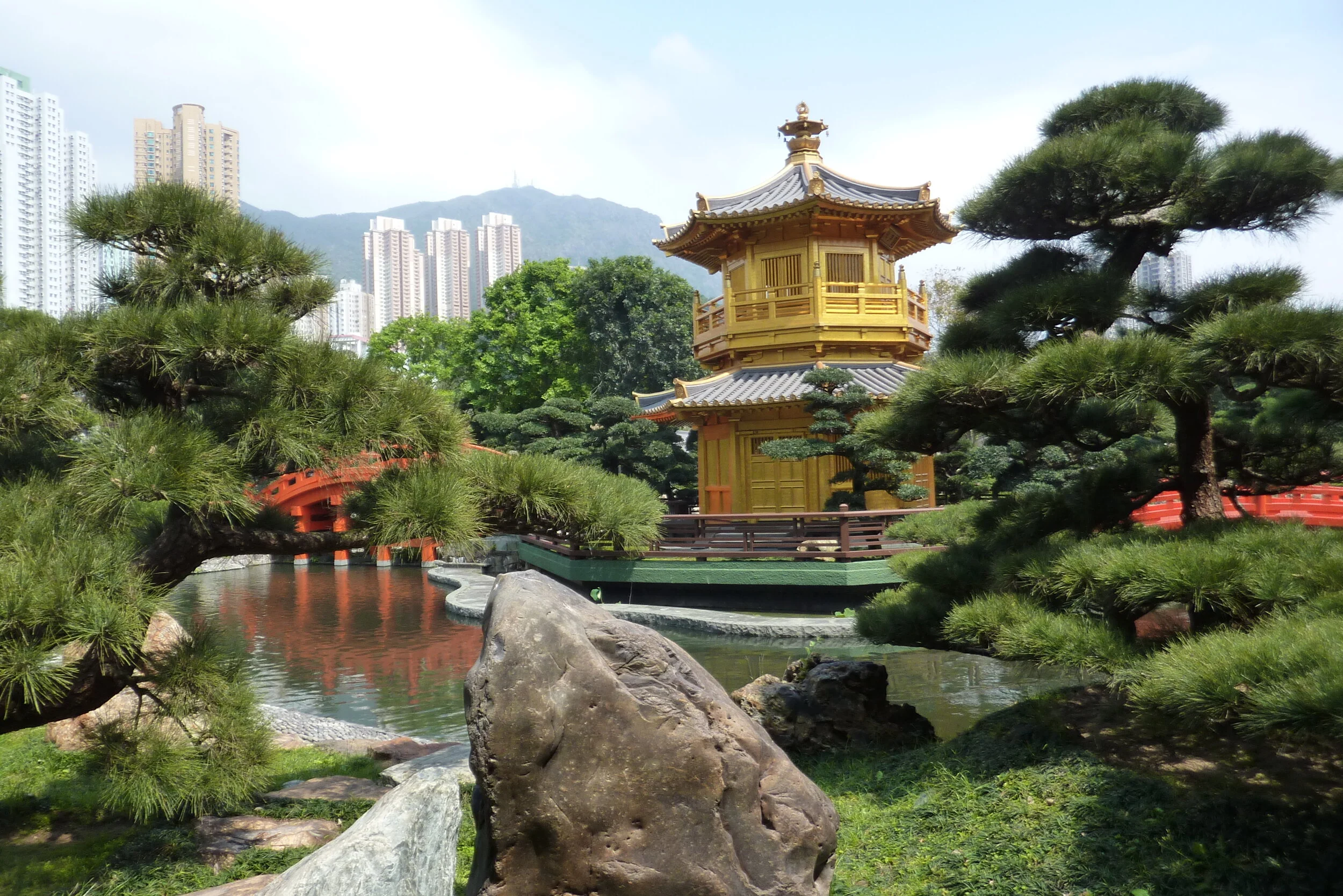
this one in Hong Kong (cared for by the adjacent Chi Lin Buddhist Nunnery)

pictures\March 2017 HAL Japan to HongKong Cruise\p1100682

and this one in Taipei

P1100508.JPG

The painting incorporates key components from these gardens - a pagoda reflected in a tranquil pool crossed by an elegant bridge, cherry blossoms, an artistically pruned topiary tree and a symbolic large rock carved with a message.

The first step was to create a pencil drawing on the canvas.

P1110150.jpg

Then the base colors were painted for the entire canvas.

P1110163.jpg


P1110166.jpg
P1110952.jpg


Next came the time-intensive painting of all the individual patterns on top of the base layers of color.

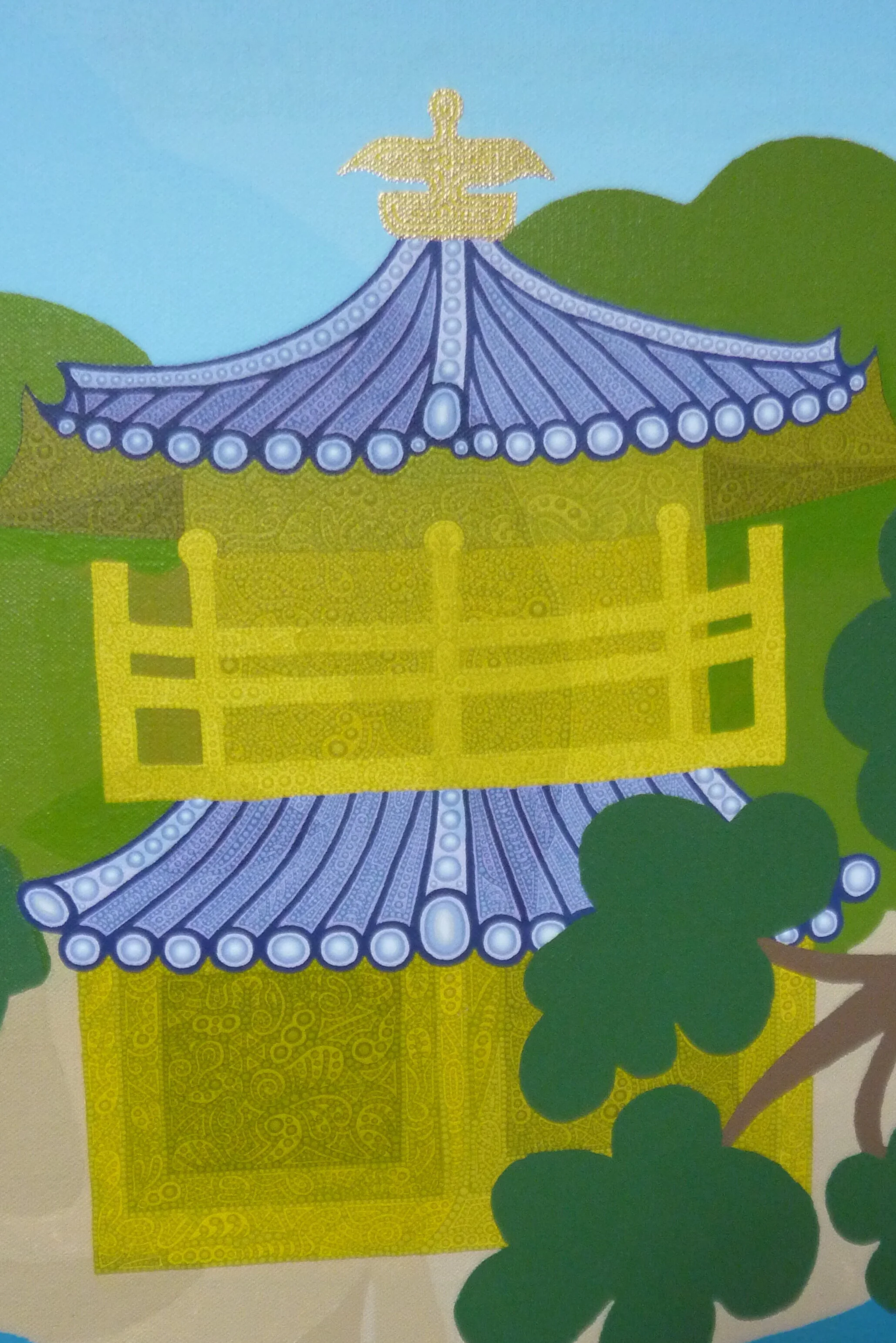
I began with the pagoda.

P1120005.jpg

Then the background trees.

P1120028.jpg

The topiary tree.

P1120242a.JPG

The ground around the pagoda.

P1120265crop.JPG

The large rock carved with the symbol for tranquility.

P1120271.jpg

The bridge over the pond.

P1000186.JPG

And the cherry blossoms.

P1000192.jpg

Finally for the pond and its reflections, I used waves of dots instead of patterns.

P1000230crop.JPG
P1000225.jpg

And here is the finished painting. In these serene gardens, I always feel that the spirit of the Buddha might be looking over them. If you look closely, you can find this spirit.

M-Henry-1 Enlightened Garden.jpg

I’m currently working on a new painting that will be another addition to my Exotic Places gallery. I look forward to sharing it with all of you when it’s finally done, but I must thank you ahead of time for your patience, as we will all need to wait many months for its completion due to the intensely detailed nature of my Contextural style.

Until then, stay safe and healthy!

Majestic Africa, Part 2

As fascinating as our trips to Kenya, Tanzania and Zambia were (discussed in Majestic Africa, Part 1), Botswana was even better.  We flew into a more isolated area, and the animal activity was unmatched.

As the baobab trees were a highlight of our earlier African trips, the graceful acacia trees captured our attention in Botswana. Here we are standing in front of one during a mid-morning tea break on one of our game viewing drives.              

scan acacia web.jpg

We had some of our most memorable "Big 5" animal encounters in Botswana. We encountered the massive elephant below (soon to be painted) as we floated along the Chobe River in a small boat in Chobe National Park. He was not pleased as we got closer to the shore, and he came to the water's edge to challenge us. Luckily he decided to stay on shore as we slowly drifted by. 

scan chobe web.jpg

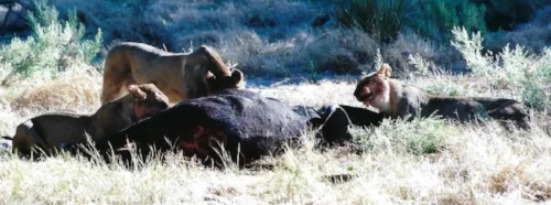
We also had our single most memorable African game experience ever in Botswana. One morning we came upon a group of female lions lying in the grass with a large cape buffalo. This scene was odd since these animals do not hang out together. On closer look we could see that  the lions' claws were digging into the buffalo's hide. Suddenly the buffalo wrenched free and stood up, but was immediately attacked again by the lions who dug their teeth and claws into its rear flank and tried to pull it back down. The buffalo fought them off again and again, but each time the lions would attack and the buffalo became more and more exhausted.         

scan buff2 web.jpg

After about an hour of this wrestling, a large male lion who had been sleeping nearby got up and, seemingly tired of this ongoing struggle, grabbed the buffalo's throat with a powerful bite and quickly suffocated it. Showing incredible strength, he then flipped the dead buffalo over, tossed it onto the ground and went back to sleep.

scan buff3 web.jpg

As soon as the male left, the female lions started ripping into the dead buffalo's belly.  It wasn't long until they were head and shoulders into its entrails.

scan buff5 web.jpg

The kill was heartbreaking, however the aftermath was fascinating.  We came back to this scene each morning and night for two more days as the lions continued to feed on the carcass.  It was amazing to watch all of the other animals coming to check out the kill. Below is a leopard who haunted the site but never succeeded in challenging the lions. Elephants, baboons, hyenas and other animals also stopped by to see what was going on. With so many animals approaching from all different directions, it seemed like quite the social event.

scan buff6 web.jpg

And of course, more and more vultures flew into the surrounding trees waiting for their turn.

scan buff8 web.jpg

After two full days, the lions finally finished with the carcass and moved on.

scan buff7 web.jpg

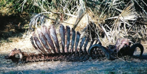
Then the vultures moved in. When we stopped by the next day, the carcass had been cleaned down to its bones, horns and teeth and this is what was left.  

scan buff9 web.jpg


Chobe Checker

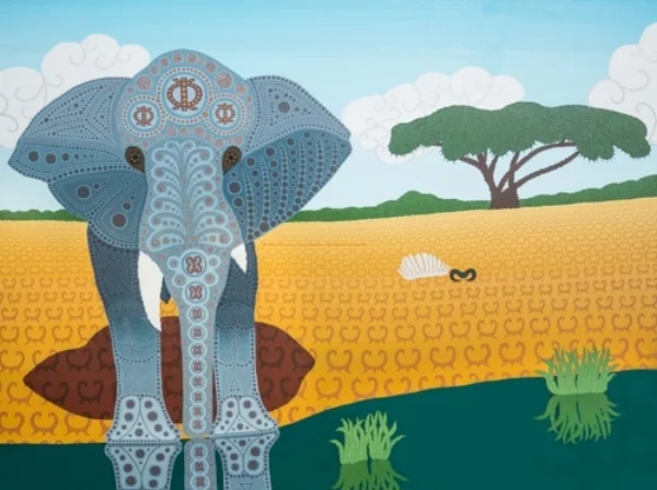
My painting 'Chobe Checker' is a composite of these experiences in Botswana. 

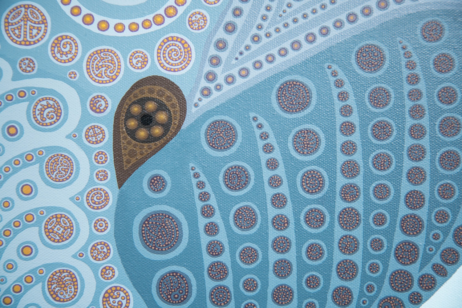
The bull elephant we met on the Chobe River is the star of the painting. Similar to my earlier 'Rhino' painting, the elephant is painted using smaller patterns and dots painted within the large dots painted inside larger patterns.

Web Chobi Checker.jpg

Here is a close-up of the elephant's head showing the patterns and dots painted within the dots of the larger patterns.  

Web Chobi Closeup Forehead and Eyes.jpg

Here's another close-up of part of one the elephant's ears.    

Web Chobi Closeup Eye and Part of Ear.jpg


African symbols are also incorporated into the painting. The Wawa Aba symbol representing strength and toughness is used on the elephant's forehead.

Web Chobi Closeup Forehead and Eyes.jpg

The Pempamsie symbol representing readiness and hardiness is used on the trunk. 

Web Chobi Closeup Total Head.jpg

A symbol representing edible plants is used as the grasses behind the elephant.   

Web Chobi Grass.jpg

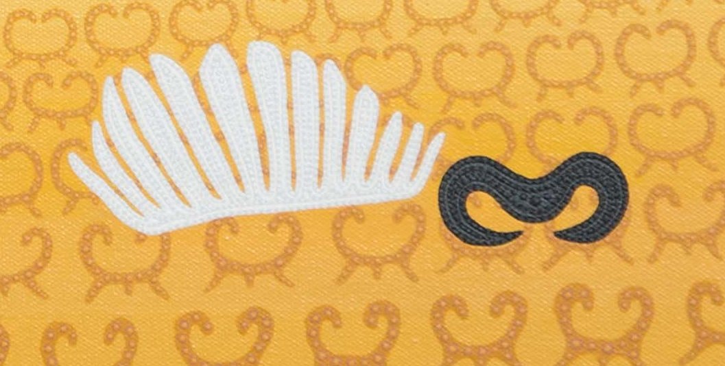
The memory of the cape buffalo that we saw killed, eaten and cleaned down to its bones is honored and represents the cycle of life and death on the savanna.

Web Chobi Bones.jpg

The beautiful acacia tree is also seen in the background.      

Web Chobi Tree.jpg

All of these memories come together in the 'Chobe Checker' painting.  Here he is checking us out.

WMWebChobiChecker.jpg


Birds of a Feather? 

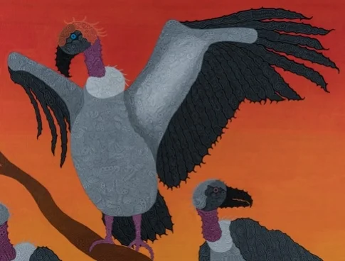
Our experiences in Botswana also helped inspire my most recent painting 'Birds of a Feather?'. As seen in the photos above, vultures swarmed the trees all around the carcass of the cape buffalo as the lions fed on it. The photo below with a new vulture flying in to take the top spot on a branch from the others was the initial inspiration for this painting, but my other "inspiration" was the state of the world in 2017.

scanvulture orig.jpg


 In 'Birds of a Feather?',  there are three vultures lower down on the branch, each with evil reddish eyes under their grey head feathers.  None of them are taking any notice of the new arrival.  In fact, it seems that they may be making a special effort to ignore him.   There's an ominous glow from the world below.                             

Birds of a Feather Web.jpg


Here's a close-up of one of these vultures. 

Birds of a Feather web3.jpg


The new arrival is flapping his wings in self-glorification.

Birds of a Feather Web.jpg


Instead of grey head feathers, his are shades of orange above a cold blue eye.  Looking closely, his breast feathers also seem different.

Birds of a Feather web6.jpg


Below is the finished painting 'Birds of a Feather?'.    


This painting does not reflect my fond memories of Africa where I have truly had some of my favorite experiences.  Unfortunately, it does reflect my mood about the world during 2017.  I for one am hoping for much better times in the future and the sooner the better.  In this spirit, I promise that my next painting, already in the works, will be more serene and uplifting.

WMBirdsofaFeatherSS.jpg

Majestic Africa, Part 1

Of all of the places I've traveled, my favorite is Africa.  The beauty of the countryside and the wild animals are inspiring.  I guess that is why I keep choosing Africa for so many of my paintings. 

Three fond memories from our trip to Kenya and Tanzania are - baobab trees, graceful giraffes, and glorious sunsets.

The baobab tree, also known as the upside-down tree, is leafless for most of the year and looks like it has its roots in the air.  It is a unique aspect of the African landscape. We saw large numbers of them in Tanzania including the one below.

scan baobab web.jpg

A baobab tree is a beautiful backdrop to these two giraffes on the savanna. 

scan baobab giraffes web.jpg

Being near the equator, the sunsets in central Africa are also amazing. The sun looks huge and sets in what seems to be a matter of seconds. The silhouette of trees and animals against the sunset is often breathtaking!

I combine these memories in my first African painting 'African Sunset'.  The silhouettes of a baobab tree and two giraffes are set against the setting sun.  This large 3 ft by 4 ft canvas is completely covered by contextural patterns, all painted freehand.  

I first painted the patterns onto the yellow sun and the orange-red sky. The sky is yellow-orange next to the sun and becomes darker shades of orange and red farther away. Dots painted onto the patterns in the sky help gradate the colors from yellow to orange to red.

WebAfricanSunsetDetail7.jpg

I then painted the trunk and branches of the baobab tree and the grasses beneath it.  Patterns completely cover them. I added dark washes over these patterns to enhance the silhouette effect. The patterns are difficult to see under the washes, but if you look closely you can see them.    

WebAfricanSunsetDetail5.jpg

Finally, I painted the two giraffes. The giraffes are also completely covered with patterns and then with dark washes.

WebAfricanSunsetDetail1.jpg
WebAfricanSunsetDetail6.jpg

The finished 'African Sunset' is below.   

WMWebAfricanSunsetSS.jpg


My second African painting 'Rhino' was inspired by our short stay in Zambia. We went to Zambia primarily to see Victoria Falls.   The falls were massive and drenching, but because of the mist, they were hidden much of the time.

scan victoria web.jpg

Zambia is not known as a great photo safari destination because it doesn't have any of the big cats. However it surprised us. There was still a lot to see along the Zambezi River above the Falls, such as elephants up close and personal.  

scan elephants web.jpg

And hippos, said to be the most dangerous animals in Africa (look at those teeth)! 

scan hippo web.jpg

And, of course, more beautiful sunsets (over more hippos).  

scan sunset web.jpg

Plus, we stayed in a wonderful 'treetop house' hotel.    

scan treetop web.jpg

However, what surprised us most about Zambia was how close we could get to the rhinos. Unfortunately, the poaching of rhinos in Zambia is so bad that the few remaining ones are guarded 24 hours a day by armed rangers.  Because of this constant attention,  the rhinos are getting used to having people nearby.  They initially ran away from our jeep, but then slowly came back to inspect us.  How close did they come?  How about 6 feet from Lorrie, and she was still smiling!

scan close rhino web.jpg

The rhino below was the inspiration for my painting. At this point it was posing about 15 feet away.

scan rhino web.jpg

The entire 3 ft by 4 ft 'Rhino' canvas is painted freehand with textured patterns and dots, giving it the look of an African textile.  Given the rhinos' struggle for survival, I incorporated traditional African symbols for strength - the ram's head  

WebRhinoDetail7.jpg

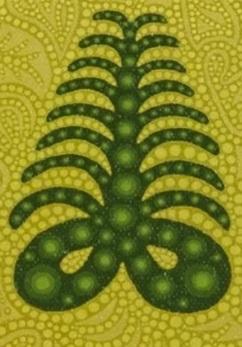
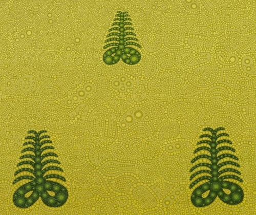
and for endurance - the fern.   

WebRhinoDetail9.jpg

The patterns and dots covering the entire background are the grasses of the savanna.     

WebRhinoDetail8.jpg

The rhino itself is composed of patterns and dots layered upon patterns and dots, representing atoms combining to form bones and tissues, all combining to form the finished creature.  An example of these layered patterns and dots is seen in the close-up below.  The ribs and backbone each began with a single large pattern. Large dots were overlaid on to them, and then each of these large dots were filled with smaller patterns and dots.     

WebRhinoDetail4.jpg

Another close-up example of these layered patterns and dots is shown below for the rhino's head and two horns.

WebRhinoDetail3.jpg

After more than 18 months of work, I finished what became the award winning 'Rhino' which is shown below.     

WMWebRhinoSS.jpg

In my next post, I will discuss my two most recent paintings 'Chobe Checker' and 'Birds of a Feather' which were both inspired by our trip to Botswana.    


Natural Wonders

As much as we enjoy traveling around the world, we have found magnificent natural beauty here at home in our national parks.  Contexturalism, with its layers of color and texture, is a great style for portraying these natural wonders.  


Crater Lake

Oregon's Crater Lake is one of these magnificent spots. There are innumerable awesome vistas around the lake, but my favorite was this one overlooking the Phantom Ship.  This view seemed perfect for a painting.

The stars of this painting are the Phantom Ship and the rim of the crater as they are reflected on the deep blue water of the lake. Using a little creative license, I decided to edit out all but three large trees in the foreground to assure that these stars are seen clearly as the primary focus, and to imagine the view in the golden glow of sunrise. 

The Phantom Ship is painted in golden colors against the deep blue lake. Its reflection in the lake is painted with a darker gold color. This reflection has mirror images of the patterns found on the ship itself which I found much more difficult to paint than I expected. I did not put the final layer of dots on the Phantom Ship or its reflection in order to better portray the separate craggy rocks that make up the ship.  The dots would unrealistically smooth out these rocks.

The rim of the crater and its mirror-image reflection are painted with similar golden colors.  The mirror-image reflection on the right was particularly difficult to paint since it went so much farther into the lake.  I again left the final layer of dots off of the areas of bare rock to give them a more rugged appearance, but I added a layer of green dots on the wooded areas of the cliffs to represent individual trees in the distance.  These dots are also reflected in the water (as is my signature among the dots).


The same technique was used on the rim on the far side of the lake. The water is a lighter shade of blue in the distance and the golden colors are more muted. Green tree-covered mountains are seen in the far distance beyond the rim.

The large fir trees in the foreground were painted using the full contextural style including the final layer of dots.    

My finished Crater Lake painting is shown below.  


Death Valley - Zabriskie Point

On our trips to Las Vegas, we prove that contrary to popular opinion, gambling and partying are not required to have a great time. Of course we enjoy some of the great buffets and the many free or nearly free shows both inside and outside the hotels - such as the Bellagio's water show and its Conservatory and Gardens.  We also love checking out any new hotels to see what kinds of over-the-top attractions they have to offer, but best of all for us are our day trips to places like Death Valley

We went to Death Valley having little idea what to expect.  All I knew about it was that pioneers who tried to cross it in the movies usually died from heat and lack of water. We weren't too worried about the heat since it was February. In fact we almost froze to death on top of one of the mountains overlooking the valley as the wind gusted to about 50 mph. What we were definitely not expecting was the awesome beauty of the place.  

The rock formations in the canyons leading out of the valley were wonderful, as were the sand dunes and the endless mounds of borax.  However the best place we found was Zabriskie Point.  It took these two pictures stitched together to capture the full expanse of this deeply carved landscape.     

These intricately carved formations promised to be one of the most challenging paintings I had ever tried.  My first decision was to replicate the two photos by using two separate 11" x 14" canvases.  I made this decision because I wanted to work on the initial drawings while traveling, and the ship was sailing. I could easily fit an 11" x 14" canvas in my luggage, but not an 11" x 28" one. 

I always do a pencil sketch on the canvas before starting a painting.  Many of these sketches are simple outlines to identify the basic shapes and sizes for each of the components of the painting.  However for this painting it was obvious that I would have to complete a very detailed drawing before I could start painting. So every sea day afternoon on our cruise between the various educational lectures, I spent a few hours drawing the first of the two canvases.  By the time we returned home, I had completed the sketch on the first canvas and was beginning the sketch on the second.  This was the first time I had done such a complete sketch, and I liked it so much that I wasn't sure that it needed to be painted!

However the painting was well worth the effort.  The contextural style with its layers of color and texture not only enhanced the carved formations as seen in the closeups below,


but also worked well when painting the distant mountains.

The two canvases were painted at the same time so that the colors could be matched thus allowing them to fit perfectly together in the final painting.  I built a box frame that showcases the two canvases together. Each canvas could be shown separately, but together they provide the expansive beauty of Zabriskie Point.  


Bryce Canyon - The Amphitheater

As wonderful as Crater Lake and Death Valley are, it's hard to believe, but Bryce Canyon is even more awesome. To truly appreciate it, you have to go to Bryce Canyon and walk among the multitude of carved spires (called hoodoos) and admire the ever-changing hues of yellow, orange, rust, pink and brown. Part of its splendor is that it is so accessible.   

Our favorite overlook in the park and probably its most famous is called The Amphitheater. 

As challenging as the drawing was for Zabriskie Point, I knew this drawing would be even harder.  I decided to use a small 11" x 14" canvas so that the amount of drawing would be minimized.  The downside was that in order to paint the delicate spires onto this small canvas, I would have to do the entire painting using toothpicks. 

I started with the upper rim of the canyon, and carefully drew the details of The Amphitheater section by section. 

I then started the painting.  I've been having trouble finding a slide show site that I like (send me any suggestions you might have), so I'm going to show you many of the individual slides here that show the progression of the painting.  I started by painting the base layers of color first onto the canyon floors, and then slowly onto the cliffs and hoodoos. 

bryce edit 10.jpg


Then I added patterns over the base layers, and a final layer of dots onto the patterns.    

bryce edit 29a.jpg

And finally, the finished Bryce Canyon painting.

I enjoyed painting these scenes from our national parks and believe that the contextural style fits them well.  I am sure that I will do more of these paintings, but I'm currently working on African scenes as you saw with my recently completed Chobe Checker.  I plan on discussing my African paintings in detail in my next blog post.

Samurai Secrets

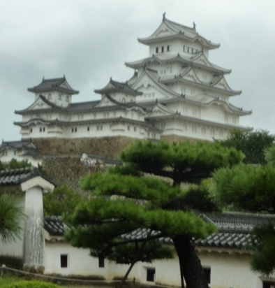
Having recently returned from a terrific journey to Japan, it seems a perfect time to share insights into my three samurai paintings. Using our trusty Rail Passes, we left the mega-metropolises of Japan behind and headed for the smaller cities where many historical sites from the time of the samurais still exist, such as the authentic Himeji Castle,        

and an ancient mountain temple complex made famous as a setting for The Last Samurai movie with Tom Cruise.         


Samurai

My original Samurai emerged from one of my imaginary creature ink drawings.  With the addition of acrylic paint, he took on a more colorful, spirited essence. In this first painting of the series, the sprinting samurai creates airwaves that swirl around him in the background.

I liked my Samurai so much that I decided to create additional paintings setting him into traditional Japanese scenes.         


Rising Sun Samurai

The second painting in this series is Rising Sun Samurai.  The rising sun of Japan set against an orange sky above lush green hills dominates the top portion of this painting.         


The center portion is highlighted by the samurai and his shadow running along a path toward the distant hills.      

The contextural patterns making up the grass along the path are covered with yellow and blue dots representing wild flowers.    


Along the path and in the distant hills are a series of Japanese symbols.  The original symbols can be identified, as they are painted with dark brown backgrounds covered with lighter brown dots upon dots.  Additional colors and images have been added to help disguise them and turn them into part of the landscape.

The first two symbols are shown below.   The symbol on the left has been turned into a small building by the addition of a brown roof (with darker brown dots) and yellow walls with gold accents.

The second symbol has become a Japanese lantern with birds flying on its gold background and a purple shield displaying the three comma-like shapes of the mitsutomoe that is seen all over Japan. 

These two symbols can be found in the lower left portion of the painting.

The next four symbols are in the distance on top of the hills with their shadows falling down below them.  The two lower symbols have been turned into pavilions with the addition of roofs.  The two upper symbols have been left untouched since they look like majestic sculptures against the sun.  

The final three symbols are in the lower right portion of the painting. The first symbol becomes a bush when leaves are added. The second symbol is seen as another small building with its own brown roof and yellow walls.  The final symbol transforms into a woman in lavender and gold at a garden trellis.

When all nine symbols are read from the lower left up to the top of the hills and then back down to the bottom right, they spell out 'Respected Ancient Samurai Hero' in Japanese.

The complete Rising Sun Samurai is shown below.  


Seaside Samurai

In the third painting of the series, the samurai is running along the seaside as seen in the bottom portion of the painting detailed below. 


The sea is crashing against ragged rocks, seen both above and below.  The rocks are painted using intricate patterns as seen in my other contextural paintings.  However, the sea is painted using dots free-floating on the darker blue background, portraying their greater fluidity.

In the center portion of the painting, fog is floating along the ground.  The fog was created by painting lace-like patterns of white over the background of grass and mountains.

In the top of the painting, large fir trees and looming mountains (each painted with intricate patterns) are seen in the distance against orange-hued clouds at sunset.       

The complete Seaside Samurai pays tribute to traditional Japanese paintings.   

Our recent travels rekindled my appreciation of the magnificent natural beauty of Japan, and reminded me of why I so much enjoyed the great effort that went into creating these three paintings.  I'm pleased to be able to share them with you.

I'm now starting to work on a slideshow detailing the creation of Seaside Samurai.  I will post a link to this slideshow when it's finished.     


Introducing My Newest Painting - Chobe Checker

On our trip to Chobe National Park in Botswana a few years ago, we were floating down a river when we approached a large male elephant who was on the nearby shore.  The elephant was very upset with us as we drifted closer and walked aggressively to the water's edge to check us out and challenge us.  I've spent the past year painting this elephant and the result is Chobe Checker.     

To provide a better idea of the process of creating this painting, I've put together a slideshow from the 12 months it took to complete it.  Go to this web address to view it - http://slide.ly/view/084d6bb1d6307875572f912f219f379d - (Highlight the entire address, right click it on it,  and then click Open the link.)

Turn on the sound on your computer to hear the accompanying music and hit the full screen button in the lower right corner to best experience it. Let me know if you like it and whether I should create slideshows like this for my other paintings.  Enjoy! 

Imaginary Creatures, Part 2

Drawing imaginary creatures is where my art began, and I've gone back to them over the years for inspiration.  In this post, I first talk about two of my earliest creatures in the painting Chasing Temptation.  Then in Jain? and The Old Soft Shoe two of my dancing creatures are the stars.    

I also use my contextural style to reinterpret characters from famous paintings into my own imaginary creatures. To end this post, I present two of my reinterpretations - one from a famous European painting and another from an iconic Asian painting.


Chasing Temptation

Chasing Temptation includes two of my early imaginary creature ink drawings.

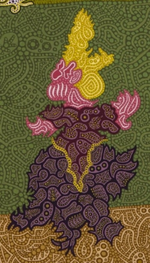
Transformed using my contextural style, the first creature becomes a pink-skinned maiden with golden hair wearing a beautiful dress,  

and the second creature becomes an exotically colored temptor. 

The maiden is following the flying temptor along a path out of the forest below, 

towards the alluring unknown of the castle-topped mountains.

The sky is aflame in the distance, and storm clouds are gathering. Who knows what the future holds for this maiden as she chases temptation!


Dancing Creatures


In our travels, I was impressed by the Jain temples in India and the terraced rice paddies in Bali.  The dancer originally seen in Haunted Temple Dancer gets to experience both in the painting Jain?


The Old Soft Shoe focuses on one of my creatures that reminds me of a tap dancer.      

 This was the first painting where I reversed my usual contextural technique that paints darker patterns on top of a lighter background base layer. In this painting, I painted lighter patterns on top of darker base layers.  The lightest color is on the outline of the creature which makes it shine brightly against the dark background.


Reinterpreted Creatures as Homage


Not all of my creatures are based on my own drawings.  Some of them are inspired by other paintings.

My Tribute to Gericault's Mounted Officer was inspired by the famous Gericault painting below.

My contextural interpretation of the painting changes the feeling from the realistic fury of battle into a tribute to the majesty of the officer and his mount.


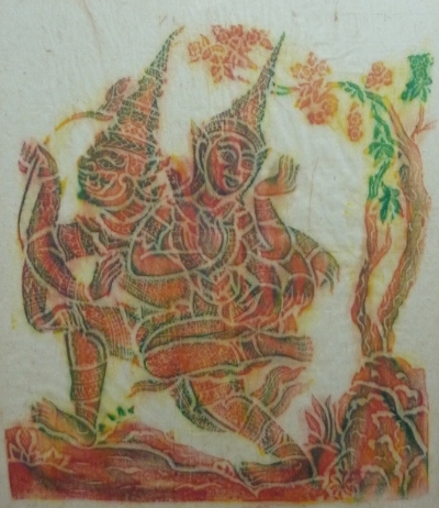
When traveling in Southeast Asia, you find varied paintings depicting the chapter of the epic Ramayana story in which Princess Sita is taken by a demon.  I used the wood block painting below as the inspiration for my interpretation of The Abduction of Princess Sita.     

Wood block paintings use only limited colors and texture.  My contextural style uses many more colors and creates textures that help make the painting more vivid and impactful.

Look for more to come in my next post when I tell all about my samurai creature paintings.


Imaginary Creatures, Part 1

Baywatch Babe, discussed in the previous Babe in Paradise blog post, was the first imaginary creature I painted based on one of my earlier ink drawings. Although I consider this figure to be abstract, it is easily recognizable as a female creature on a beach. However, many of my later imaginary creature paintings are a bit more abstract. For example, how should this painting be hung? This way? 

Or this way?

And what kind of creature is it? With this abstract painting, the viewer can decide. Whatever you see in the painting is what it is to you.

What's most interesting to me about this painting is that it is the first of my 'macro-micro' paintings.  The macro portions of the painting are the large patterns that make up the overall shape of the creature and the background that you can clearly see from a distance. The micro portions are the painted patterns within each separate circle that make up the 'dots' on top of the macro patterns. Below are some examples of these micro paintings within the 'dots'. Notice that there are also dots on the patterns in these micro paintings. If I could paint small enough, I could paint patterns within these dots as well.  Theoretically, these micro paintings within the ever smaller 'dots' of the previous micro paintings could go on forever.

I did another version of this painting with a totally different color scheme and added a new micro technique. 

Within some of these 'dots', I have done the same type of micro painting of patterns as in the previous painting.  You can see examples of these micro patterns within the large circles below.

However in many of the other 'dots', instead of micro patterns, there are circles upon circles of lighter shades of the same color creating depth.  Examples of this new micro technique can be seen in the 'dots' below.

Another of my favorite imaginary creatures is RALF.  Most people agree on which direction this painting should go, but there's a wide variety of opinions as to what type of creature RALF is. Again what you see is what it is to you.

RALF is another 'macro-micro' painting that uses the same variety of micro painting techniques as the previous painting.  The 'dots' on the RALF creature are each filled with micro painted patterns, while the 'dots' in the background contain circles within circles of lighter shades of the same color.

I liked RALF so much that I created a world for it in another painting RALF's World, in which I also used creatures from some of my other paintings.

RALF is shown moving along a path enjoying an outing in this world.

If you look closely, you can see wildflowers represented by the red, blue and green dots in the background.


In addition to RALF, the first two creatures discussed in this posting are included in the sky. Their placement should give you a good idea of which direction I think these paintings should be hung, and what kind of creatures I think they are (as do their names Winter Flight and Summer Flight)

Some of the creatures from Sunday on Turtle Pond discussed in my Hidden Treasures posting are also included in the water.  

The rock formations were inspired by our trip to the Cappadocia region of Turkey.  Those of you who have been there will recognize their shapes but not their colors.  RALF's world is of course more colorful!

The patterns from the rock formations bordering the water are reflected in the water to create mirror images. Painting these mirror images of the patterns was much more difficult than I expected and gave me plenty of headaches!   

In the next posting, I will talk about more of my imaginary creatures.

Hidden Treasures

Our recent trip to Southeast Asia reminded me of my many paintings from our earlier trips to this fascinating part of the world. While painting the first of these, Bali,  I discovered how to 'hide' images by slightly varying the colors of the patterns. If you look closely at this painting of terraced rice fields in the mountains, two garuda birds (cultural symbols of the region) can be seen floating in the sky.

In a close-up, the image is much easier to see.

Bali was also the first painting in which I 'hid' my signature within the patterns. Now one of the first things people do when they see one of my paintings is search for the signature.

Here is a close-up of the Bali signature.  It can be quite challenging to find on many of my paintings.


Using hidden images was so intriguing that I used them in many more of my Southeast Asia paintings. 

Angkor Wat, the ancient temple complex, is the highlight of any trip to Cambodia. However as wonderful as it and the rest of Cambodia are, the bloody history of the Khmer Rouge still lingers.  In Angkor Why? as the name implies the temple's beauty is haunted by the hidden skulls overlooking it.


A close-up shows one of these skulls more clearly.


There are also hidden images of stone carvings on the temple walls such as this one above the main doorway.


Images are even hidden in the portrait Mountain Lady Vietnam.  Look closely and see if you can find any of them.  These are more challenging to find. 

Hint: Images of four celestial animals  (the tiger,  the bird, the turtle and the dragon) are hidden in the green background clockwise from lower left to lower right. In this case when I say hidden, I mean it!


The images in Haunted Temple Dancer are more obvious.

This painting was inspired by the many heavenly dancing girl carvings (Apsaras) on ancient temples throughout Southeast Asia.  Although the carvings have deteriorated over the many centuries, they are still magnificent. On both sides of this stylized Apsara carving in its original glory are ghost dancers foreshadowing its less-glorious future state.


Hidden images are also included in some of my other paintings.  The painting of our cat Teelka has her name hidden in large letters. Can you find it?


 A close-up of the background between her ears might help, although it's still well hidden.


Finally Sunday on Turtle Pond has many turtles hidden throughout the pond. How many can you find?  (I'll discuss the other creatures in this painting in a later blog.)  

 As you see, contextural paintings allow for all kinds of images to be 'hidden' among the patterns, making them more interesting and fun to both paint and view .


Totally Inspired!

It's hard to take a break from painting except when the break is inspiring. We just returned from an amazing trip to Southeast Asia, where, in addition to the expected magnificent temples and terraced rice paddies,  we also experienced our first total solar eclipse!  We were rookies, but many people traveling with us have been chasing eclipses around the world for decades. Here's a photo of 'totality' when we could finally remove our special protective glasses and look at the eclipse with our naked eyes.  Totality only lasted about two minutes but was definitely awesome! 


Of course the temples were not disappointing, such as the Shwedegon Pagoda in Myanmar (shoes and socks are forbidden),

and Borobudur Temple, once swallowed up by the jungle, but now the number one tourist destination in Java, Indonesia.


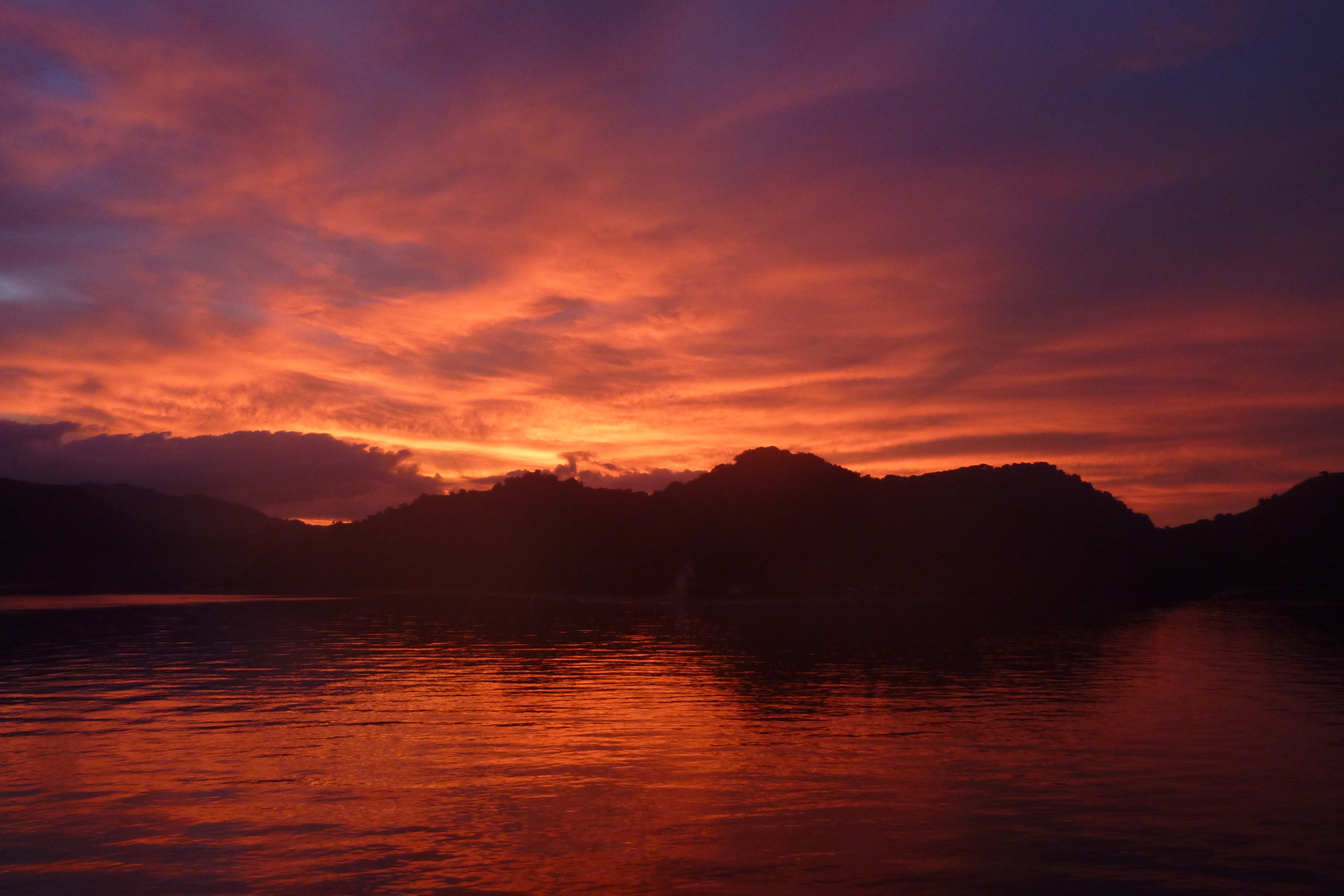
We also saw marvelous sunsets, like this one in Lombok, Indonesia


and exotic wildlife like this komodo dragon who can smell prey from 2 kilometers away and has been known to include unlucky humans on its menu!


Although this memorable trip did take me away from my painting (and blogging), it was well worth it and will likely inspire many future paintings.  But the time finally came to return to the ...


Flowers of Charlotte


As wonderful as it was in Southeast Asia, it was not too disappointing to return home to Charlotte. This is the best time of the year in Charlotte with trees and flowers blooming everywhere and with warm, pleasant weather without the heat and humidity we get later in the summer (and had everywhere in Southeast Asia!). It's the perfect time for me to talk about my paintings of flowers.


Large Peony

You've read previously that my painting Not Monet's Sunflowers was the first to incorporate my contextural style. However, the full contextural style was used only in the background of the painting, not for the sunflowers.  It was time to try it on a painting of a flower itself.

I like the wonderful texture of peonies, so they were my first choice. I wanted the painting to be large enough to allow for the patterns to be easily visible, so I decided to use a 3 ft. by 4 ft. canvas. To help the flower stand out, I chose to paint a non-textured dark green background. The flower was to be the star, so the patterns on the leaves would be flatter and less textured than the flower.  Here's a close-up of some of the leaves and background.


The peony had a vast range of colors ranging from white, to shades of pink, to deep reds, and was greatly textured with its myriad of small petals. The original pencil drawing of the flower was very challenging and took many days. The base layers of the flower were painted using light hues of the appropriate color for each individual petal. The patterns for each petal were then painted onto the base layers using darker, richer hues. Then dots were added on top of the patterns to complete the contextural effect for each petal.  Here's a close-up of some of the petals.


The contextural style worked very well as the individual petals merged together to create the total flower.


The dark green background and the less textured leaves also worked well together to make the flower pop in the finished painting seen below.


Yellow Roses

After the success with Large Peony, I used a similar approach to paint some yellow roses. There weren't as many small individual petals on the roses, so there wasn't a need for as much detail, and a smaller 20" by 24" canvas was appropriate.

The roses were painted using lighter hues of yellow for the base layers of the petals, darker hues of yellow for the patterns on the petals, and a final layer of dots on top of these patterns. The yellow hues had more subtle differences than the pinks and reds had had in the peony, so to create more differentiation between the individual petals I decided to add a final layer of washes. I added a dash of black to the yellow washes to darken the areas in the deeper crevices and shadows of the flowers and used a more intense yellow wash to differentiate the more colorful petals.


You can almost feel the texture of the roses in the finished painting below.


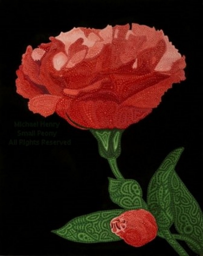
Small Peony

I then painted a close-up of a smaller peony on a 16" by 20" canvas. This peony had fewer petals than the large peony and was more like the yellow roses.  The painting also emphasized the flower's stalk with its small unopened bud among the leaves.

A darker non-textured background was painted to highlight the flower even more than in the previous works. The prominence of the leaves and stalk was increased by using darker green dots as the final layer on top of the patterns. 

The flower and bud were painted using the same approach used for Yellow Roses.  Richer colored patterns on top of lighter base layers, with lighter dots on the patterns. Darker washes were added as a final layer to emphasize the shadows and crevices of the flower in the finished painting shown below.


I was very satisfied with all three paintings and must conclude that contexturalism is a wonderful style for flowers!

Babe in Paradise

I developed my contextural painting style to create colors and textures that were not possible with my ink drawings. I was happy with my first few paintings, but I had not yet tried to paint any of the creatures from my earlier ink drawings. Now that I had successfully developed the core contextural techniques, it seemed like the perfect time to try.

I searched the creatures I had drawn over the years and decided on the one below. The black ink didn't do this creature justice. It definitely needed more color and texture.

Baywatch Babe Scan.jpg

I had always considered this creature to be female, but I needed a more detailed persona for her. After studying her for some time, I realized that she was wearing a swimsuit, and the setting for the painting should be a beautiful ocean beach with palm trees.  

I decided to use a large 3 ft. wide by 4 ft. high canvas so that I would have plenty of room for all of the intricate details of the beach, the ocean, the palm trees and of course for the creature herself, even though I knew it would take months to complete.

I imagined that she has golden blond hair. Her time in the bright sunshine has given her skin a  rosy glow that is reflected in her super-cool sunglasses. Her nose is upturned, and she has elf-like ears.


 Her swimsuit is a rainbow of colors mimicking her bubbly personality.

Her muscular arms are held high,

as she prances across the sand on her athletic legs.

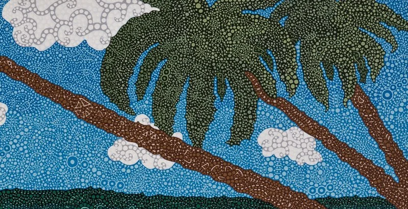
Palm trees and clouds are set against the bright blue sky.

The tranquil aqua-green water laps onto the beach along with shadows from the palm trees and the creature herself.

The painting was finally finished after many months of painstaking work. It was exciting to see the colors and textures bring my creature to life in paradise. In my eyes, she was quite simply the ultimate Baywatch Babe ;-)!

This was the first contextural painting starring one of my creatures, but certainly not the last!

The Moroccan Women

Morocco has some beautiful scenery including the Atlas mountains and the Sahara desert. When we returned from our trip there, the logical choice for a painting seemed to be a wonderful landscape.  Surprisingly though, I found myself drawn to painting some of the people we encountered, specifically some of the women of Morocco. 

I hadn't painted any portraits since my early watercolor ones, so the idea of painting portraits in acrylics incorporating my contextural style was intriguing.  There were two women in particular that I wanted to paint - a woman emerging from a desert oasis and a young girl leading a large cow by a rope in the mountains.


Moroccan Oasis 

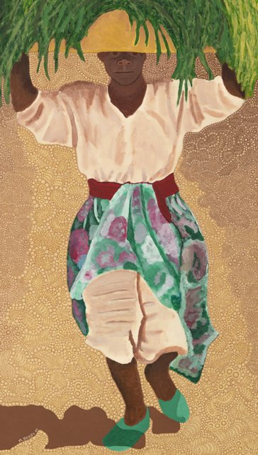
We were visiting a desert oasis when we noticed women carrying large loads of cut grasses from the stream below up to the village where they lived. One woman came out of the oasis by herself and was perfectly framed for a photo.  She seemed to epitomize the hard working Moroccan women who always seemed to be busy. She was also wearing an interesting outfit with her skirt tucked up out of her way over her pantaloons.

MoroccanOasisPhoto.jpg

A large canvas was needed for this full-body portrait, so I decided to use a bigger canvas than I had ever tried before - 4 feet tall by 3 feet wide. I liked the visual of the woman herself so much that I decided to paint her 'straight' without using my contextural style. Contexturalism would be incorporated into the background of the painting.

After drawing a pencil sketch of the woman, I started by painting the grasses that she was carrying.  By doing the grasses first, I was able to use very broad swipes of the brush with lots of paint without worrying about splattering. I would later simply paint over any unwanted splatters. Compared to my usual highly controlled painting style, painting with these broad swipes was quite fun. I was able to paint the entire area of grasses in an hour or so.


Next I painted the woman's clothes. Having never taken any painting classes, I was inexperienced at painting folds in clothes and found this part to be challenging. For her shirt,  pantaloons and belt, I decided to use my watercolor approach of painting light to dark. I first painted the whole area in the lightest color and then added continually darker colors to create the shadows and creases. I didn't know if this was the recommended technique, but it seemed to work.

I then painted her colorful skirt using the opposite approach - dark to light. I started with the darkest color over the entire area and then added continually lighter colors on top.  


I next painted her face, arms, legs and shoes. Finally I finished this non-contextural part of the painting by adding her shadow in the lower left corner. This portrait part of the painting took only about three weeks to complete.

Now it was time to start the contextural background. I immediately realized that this portion was going to take much, much longer than three weeks! The background canvas area was bigger than any of my previous paintings' total canvases.  Each color used was a custom mix, and the first problem encountered was getting enough of each color. I had to either keep mixing new paint to match or mix a large amount of paint at once and keep it from drying out. It was very time consuming to keep mixing new matching paint. It was easy to get close to the same color, but very hard to get the exact color. So I decided to mix big batches of paint and then keep them from drying out. This approach had its own consequences that I will discuss later.

The woman is shown walking along a path out of a darker background. I first painted the path using a light base layer, followed by a darker layer of patterns and finished with a lighter layer of dots. Each of these layers took multiple coats. I then painted the non-path areas starting with the darkest colors in the farthest background at the top of the painting and then gradually lightening the colors as I moved down the canvas toward the foreground. The same three layers of base, patterns and dots were completed for each set of colors before starting on the next lighter color set.  Below is a photo of this process midstream after the path and the darkest background areas were completed, and I was working on the mid canvas area.  (Who is that young man with no grey in his hair?)

MichaelOasisPhotoScan.jpg

After many months, the painting was finally finished. I really liked the finished product, especially the way the colors worked together.

WMWebMoroccan OasisSS.jpg

Now that the painting was finished, I learned the consequences of my trying to keep the paint from drying out. I had read that acrylic flow release could be added to the paint to keep it from drying out. I used it and it worked great. The paint didn't dry out. However that's when I also learned the importance of reading directions. It seems that I was supposed to dilute the flow release twenty times with water. Oops, I used it straight from the bottle. The paint was drying very slowly, taking hours instead of minutes, and then still staying tacky. Now several years have passed and it is still a little tacky. As Lorrie says, it's still tacky after all these years!


Moroccan Cowgirl

As we were touring in the Atlas mountains of Morocco, our bus came upon a group of children walking along the side of the road. One of them was a small girl, perhaps 8-10 years old,  leading a huge cow by a rope. At first she didn't want her picture taken, but after Lorrie gave her a treat (see it in her hand), she quickly agreed and even gave us a small smile. Being pre-digital camera days, Lorrie didn't see the photo until we got home from our trip and had the film developed. When she saw the picture, her first words were - "Where's the beef?" (not really).  My response was - "I didn't care about the cow.  I wanted a close-up of the girl that I could paint." So you'll just have to imagine a very large cow attached to the rope.

MoroccanCowgirlPhoto.jpg

Since this girl's patchwork-style outfit was so textured itself, I decided to incorporate my contextural style into the entire painting including the portrait. I also wanted to focus more on her face, so I painted just the upper part of her body instead of a full-length portrait. I was able to use a much smaller canvas (28" tall by 22" wide) and hoped it wouldn't take as long to paint as did Moroccan Oasis.

After again starting with a pencil sketch, I first painted the varying blue base layers for her entire dress. Then the darker patterns were painted over the base layers, and the lighter dots were added as the final layer.  

Next I painted her bandanna.

Now I reached the biggest challenge, her face and hands (minus the treat!). As an experiment I tried painting these using my contextural style. I was hoping it would give a unique, attractive effect. It did provide a unique effect, but not exactly attractive. Imagine a bad case of eczema. I quickly decided to paint over it 'straight.'  It took many layers of paint to cover the texture, but I finally was successful and the resulting face and hands turned out well. However if you look very closely, especially at the hands, you can still see the slightest texture from the final layers of contextural dots. I like to tell people that it was a cold day in the mountains, and she had goosebumps.

WebMoroccanGirlDetail1.jpg
WebMoroccanGirlDetail3.jpg

To finish the painting, I added the fir trees in the background using my contextural style. Then I tried a new technique. After the entire background had dried, I went over it with a slightly abrasive pad to take off a bit of the color and make it look more washed out by the sunlight.  It also served to further give this beautiful young lady the spotlight she deserved.

Exploring Contexturalism - Creating New Techniques

Arches Red Rocks

After Contexturalism was born out of the necessity of blending the colors and patterns in the background of my painting Not Monet's Sunflowers,  I decided that I liked the textured effect so much that I should try using it to paint some entire paintings.

We had recently visited five national parks in southern Utah, and the textured red rocks we had seen there seemed ideal for Contexturalism. I searched the photos I'd taken from our trip and quickly decided upon one of my favorites from Arches National Park for the painting. There was great texture not only in the red rocks but also in the cloudy sky, and I loved its compositon and colors.

As I attempted my first completely contextural painting, I needed to plan out the total process before starting. First I would do a quick pencil sketch of the image on the canvas. Then I would paint the entire canvas using two to three coats of just the base layer colors. These colors would need to be lighter than the colors used for the patterns that were to  be painted on top of them and would result in a 'subdued' version of the painting. 

Next I would paint all of the the patterns on top of the base layer using more vivid colors. The patterns would also need to be painted with multiple coats to assure that the base layer wouldn't show through. Finally a layer of dots would be painted on top of the patterns.

I decided to use a small 12" by 16" canvas since I had learned from painting Not Monet's Sunflowers that the multiple layers of paint needed to create the contextural effect would take a major effort to complete.  As expected, the initial steps of drawing the sketch and painting the base layer colors took only a few days, but painting the intricate patterns and then the dots proved to be challenging.  Each pattern needed to be painted with two to three coats using the smallest brush I could find and each dot had to be added individually.  These last two steps took about two months to complete, even on this small canvas. I could only do this highly detailed work for an hour or two at a time before my back and shoulders would start to cramp.

Since I was still exploring my contextural style, I continued to experiment with new techniques.  I made an important discovery that by varying darker versus lighter colors for the dots, I could create different textural effects. 

For the red rocks and bushes, I used darker colors for the dots than for the underlying patterns.

For the mountains, sky and clouds, I used lighter colors for the dots. 

WMWebArchesPark.jpg

These two approaches produced very different effects. Using the darker colored dots on the red rocks and bushes added even more color and caused the textures to be more pronounced. The lighter colored dots on the mountains, sky and clouds resulted in a more blended effect where the texture was still there but less obvious. This second blended effect was the same one I used for the background of Not Monet's Sunflowers that allowed the sunflowers to pop. The use of the darker colored dots for the red rocks and the lighter colored dots for the mountains, sky and clouds combined to make the red rocks pop even more, as you can see below in the finished painting.


Forbidden City Dragon

As the basis for my second contextural painting, I chose a photo from our visit to the Forbidden City in Beijing. The entire Forbidden City was a visual treasure land.  Near the end of our tour in the back of the complex we came upon a beautiful wall of porcelain dragons. 

I decided the right-most dragon would be a great subject for the painting. 

Even though my first small contextural painting had taken 2 months to complete, I decided that this painting needed a larger canvas to allow for the proper detail. I chose a 20" by 24" canvas, two and a half times larger than the first one and tried not to think about how long this painting would take! 

I used lighter dots on darker patterns in the upper portions of the painting to provide a smooth blended background for the dragon, similar to the backgrounds seen in my previous paintings.

WebDragonDetail1.jpg

However for the waves beneath the dragon, I developed a new contextural technique.  I painted parallel curving lines to provide the feeling of the waves' motion. Then instead of using dots on these curving lines,  I painted darker dots onto the lighter base layer between the lines to further enhance the feeling of motion.  Contrasting white wave curls were added using white dots on slightly off-white patterns.

For the dragon itself, I painted its scales using darker patterns over a lighter color base layer. However I painted lighter dots only on the inner portions of each pattern leaving the dot-free outside of each pattern as the outline of each individual scale.

I also added more color by painting the dragon's horns and eyes in yellow and its claws, tongue and fins in red and pink.

WebDragonDetail1a.jpg

I was pleased with my second contextural painting even though it had taken me about six months to complete and given me many aches and pains along the way. The painting had not only allowed me to use the contextural techniques I had developed to date, but had also presented challenges that caused me to develop some new ones for my contextural arsenal.

The Birth of Contexturalism: Not Monet's Sunflowers

As I explained in my inaugural blog post, I had chosen to use acrylic paints because I hoped to thin them to the consistency of ink and use them to create paintings using the same patterned style I had used in my ink drawings. Now that I was feeling comfortable with acrylics, I decided to give my style a try.

I stumbled upon a photo of Monet's painting Bouquet of Sunflowers. I was intrigued by the painting partly because when I first saw it, I thought it was by Van Gogh. The colors and textures in the painting seemed ideally suited to my style, so I decided to create my own interpretation of it.


WebMonetSunflowers.jpg

My first thought was to name it Not Van Gogh's Sunflowers to poke fun at my initial confusion. However in deference to Monet and to make sure that no one confused my painting with his original (ha!), I decided a more appropriate name was Not Monet's Sunflowers.

 I started by painting the patterned sunflowers and leaves. 

WebMonetSunflowersDetail2.jpg


When I painted the patterned background behind the sunflowers, I thought there needed to be a better blending of the colors. I tried adding a layer of dots of various colors onto the patterns to help blend them, and I really liked the resulting effect. It added an interesting texture to the background while smoothing out the colors and helping the sunflowers pop. 


Not only were acrylics allowing me to create colors that ink did not, they also were allowing me to use multiple layers of colors. This combination of varying colors for the base layer, the patterns on the base layer, and finally the dots on top of the patterns is what creates the textures that are the heart of contexturalism. 

To highlight the textures of the sunflowers and background, I painted the vase and tablecloth without patterns and dots.


Thus the painting Not Monet's Sunflowers was finished and contexturalism was born! 

It was not a Monet, but I was pleased with it. It confirmed that acrylics were the perfect medium for my contextural paintings.